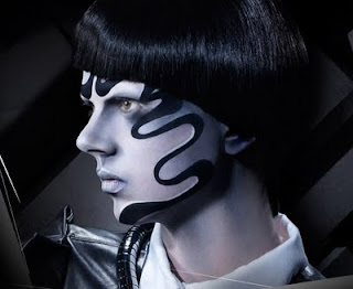
Jade-Natasha
me·trop·o·lis –noun, plural -lis·es. 1. any large, busy city. 2. the chief, and sometimes capital, city of a country, state, or region. 3. a central or principal place, as of some activity: the music metropolis of France. 4. the mother city or parent state of a colony, especially of an ancient Greek colony. 5. the chief see of an ecclesiastical province.
Monday, 4 April 2011
Basic make up application Evaluation
I felt like the basic make up application shoot went really well but when i came to edit them i realised the makeup i had applied wasn't a strong enough color to come through on my edits but am glad that i have finally finished it, i think it went as well as it could but i could have dealt with my time management a lot better, as i have said in all of my assesments. Out of my two final images i prefer the later one, the black and white grained image, i just feel as though the image tells more of a story and is more in the sstyle of the metropolis film, i do really like the colored image, otherwise it wouldn't be in my final two images, however i did only add the colored image to my final images because maurice said it was the better one out of all the color edits. im really happy with how the project has come to an end but i am worried that only having work online will present me with a problem at assesments.
more edits for basic make up application.
In editing these images i came across some problems i wanted the color of the actual make up to come through but it wouldn't as soon as i touched the contrast edit it faded to normal skin color or a beige-y color, which is not what i wanted and i couldn't come back from it. so i got the original image up changed the hue/saturation on four different save as's and ended up with a pink green blue and the original i then cut a square from all three colored ones and placed them on the original creating the second of these two images.
on the blue image of the two i placed the pink image as a background and layered the blue image on top, i then carefully rubbed out the eye section of the make up leaving a pink eye band, which i thought worked really well but i am more keen on the second of these two images.
edited make up design shots in the theme of the film.
This top image i edited most in the theme of the metropolis film, the scene where the robot was sat in the chair and turns into a woman robot and the volts of light are going up and down her body then she opens her eyes and looks away from the lens.
as much as i dislike the fact that she's looking away from the screen i am really happy with this images, there's something about it that i love whether it is the small dot's or the blurred back ground i am not sure but i really like it.
this image i edited the contrast and then turned it grayscale then overlayed a filter of cutout, i actually think this image turned out the best, out of all of them.
this image i edited the contrast and then turned it grayscale then overlayed a filter of cutout, i actually think this image turned out the best, out of all of them.
Evaluation (image manipulation)
For this unit i was really confused and not quite sure what i was doing through out the whole project now i am back on track with it now, the night i did my basic make up application shoot the final one with lauren i took her to Oday lake and took some image that would be able to cross over to this unit, half of the images i was unable to use because it was to dark outside, but the image i did get i was really impressed with which led me to not having to do more than one shoot, i researched both the metropolis film and used screen shot of the film when i was planning my shoot, i would have loved to have used the illamasqua make up for my shoot but i couldn't get hold of any in time, i actually fell in love with the illamasqua research. for the final i edited four different image and got niki, remi, abby and faith to pick there favorites, my vote was the presiding vote, we chose the second image of the four images which i will upload in a final image manipulation post in a minute, in this post i will upload the image that i edited which the blue background from the lakeside. I was really impressed with how it turned out but i have a sneaky feeling that i haven't done as much work for this brief as i actually think i have, which is obviously going to cause me to only get a pass, i think i could have definatly time managed better but i have other things going on that were more important.
Subscribe to:
Comments (Atom)


